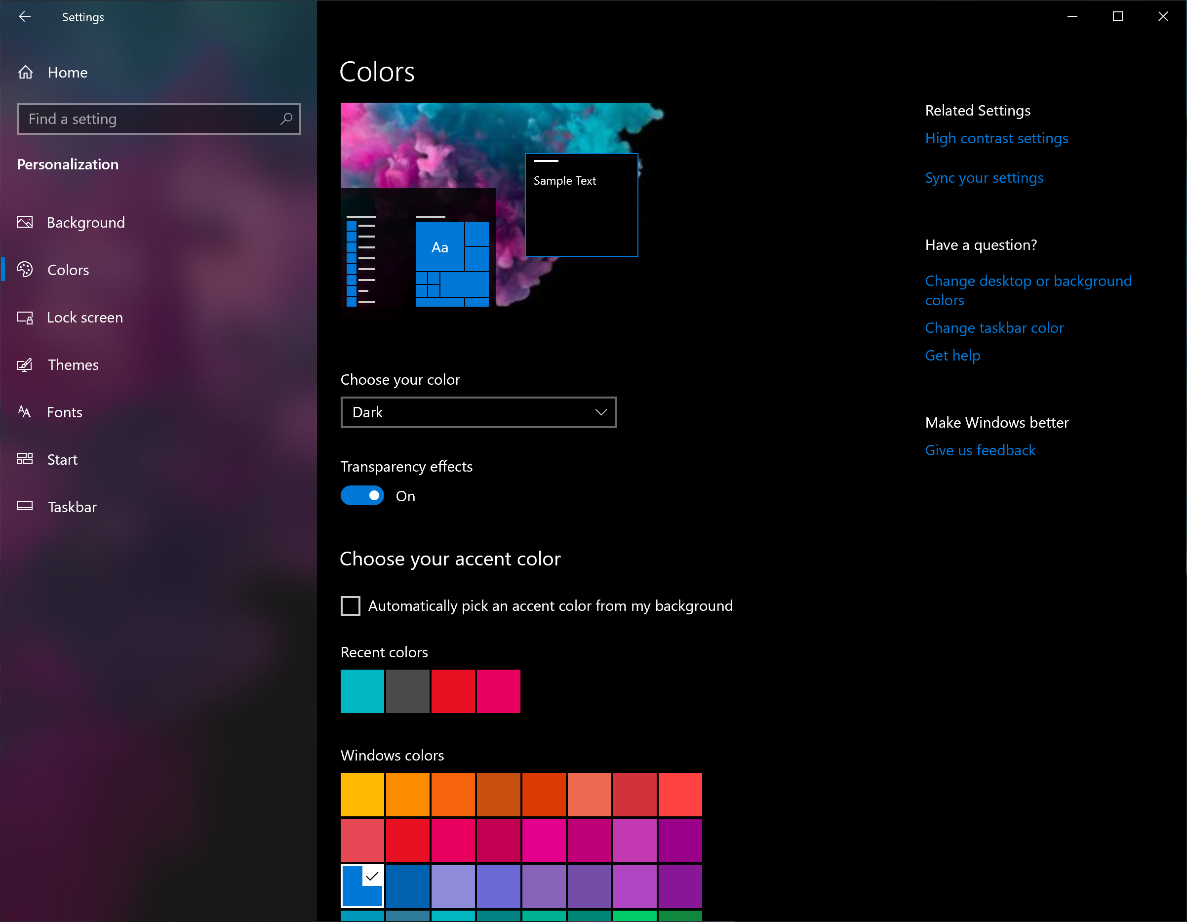


This is necessary as a pure white background would look weird but at some point, Microsoft might allow users to customize the translucency and grey shade level. It’s quite noticeable that the light theme uses dark shade almost everywhere. The Fluent Design has advanced a lot in the past few months and it has started to make Windows 10 look more modern and consistent. Microsoft has already updated the context menu with Fluent Design which plays a key role in light theme as the acrylic effect (translucency) is visible on nearly all elements. For example, context menu also has light shade. The light colour is pretty much everywhere. This could change by the time the 19H1 update gets the green light, though. As you can see in the screenshot, the Start menu background is while and the Fluent Design makes it appear transparent. This setting also brings a light shade to the Start menu.


 0 kommentar(er)
